AndrewThe Hidden Gotcha of Default VStack SpacingLast week, my colleague and I were working on a new feature. We decided to deliver most of it in UIKit, but with a little SwiftUI…Mar 14, 2022Mar 14, 2022
AndrewSimple Error-Handling when Parsing JSON with Codable in Swift: DecodingErrorWhile working on a personal project this week, I was stumped at why the response suddenly began to fail parsing. The console had no useful…Mar 3, 2022Mar 3, 2022
AndrewinI am Become Coder, Creator of Code ThingsIsNotEmpty: A Simple Swift Extension for Checking CollectionsI don’t know about you, but my mind always jolts a little when I read something like below (line 9):Nov 19, 2020Nov 19, 2020
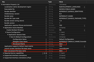
AndrewinI am Become Coder, Creator of Code ThingsBuilding an iOS app without StoryboardsWhy should I?Nov 10, 2020Nov 10, 2020
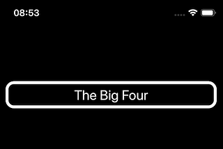
AndrewinI am Become Coder, Creator of Code ThingsProgrammatic iOS UIButton in SwiftCreating a simple UIButton completely in codeApr 22, 2020Apr 22, 2020
AndrewinI am Become Coder, Creator of Code ThingsTesting Core Data Models in Swift with XCTestCurrently, I’m teaching myself to build iOS apps in Swift as my main focus, whilst up-skilling in other areas too, such as Ruby on Rails…May 3, 20191May 3, 20191
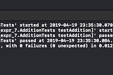
AndrewinI am Become Coder, Creator of Code ThingsRunning XCTests in an Xcode PlaygroundHaving recently been introduced to the wonders of Test-Driven Development, starting with RSpec and then Jasmine, I was challenged to port…Apr 19, 2019Apr 19, 2019
AndrewinI am Become Coder, Creator of Code ThingsI am Become Coder, Creator of SoftwareApr 14, 2019Apr 14, 2019